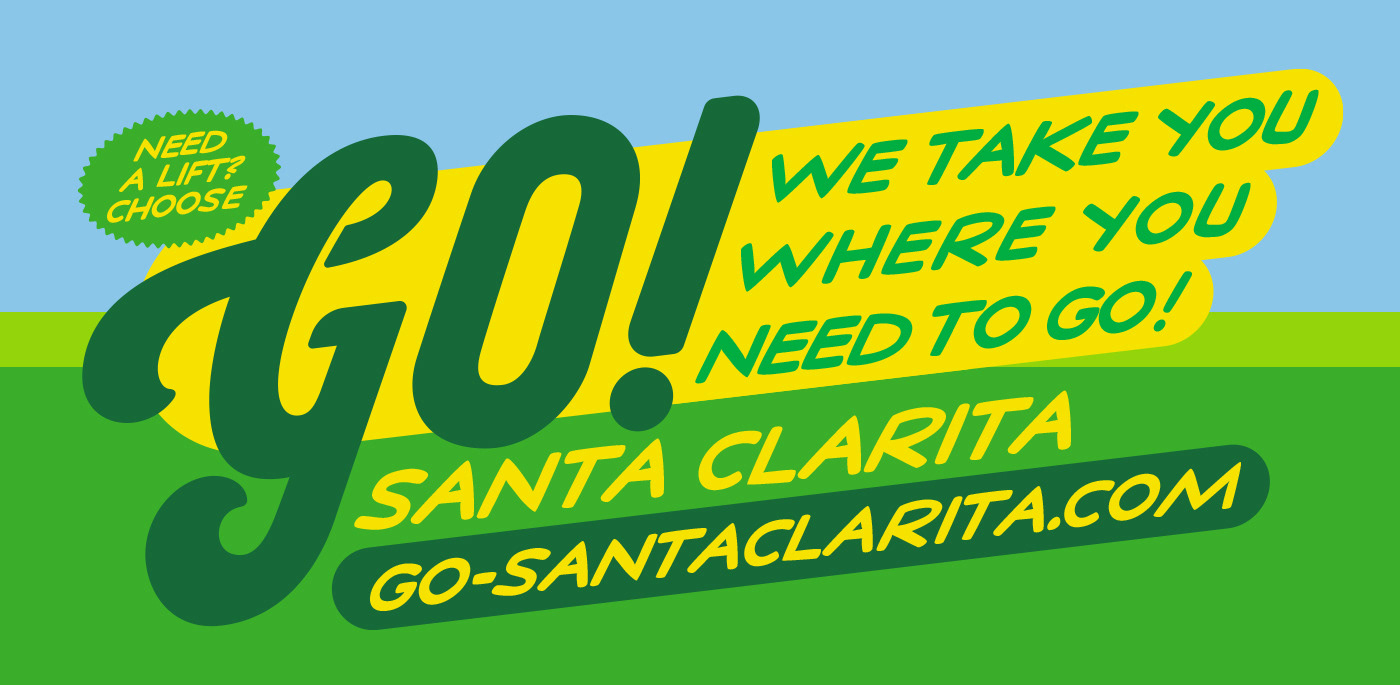
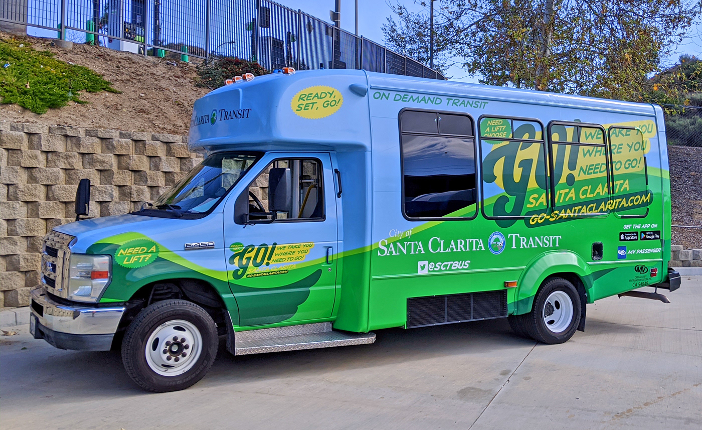
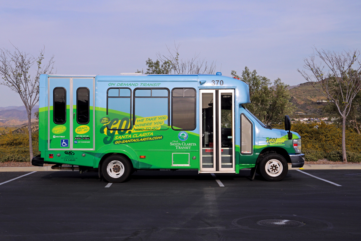
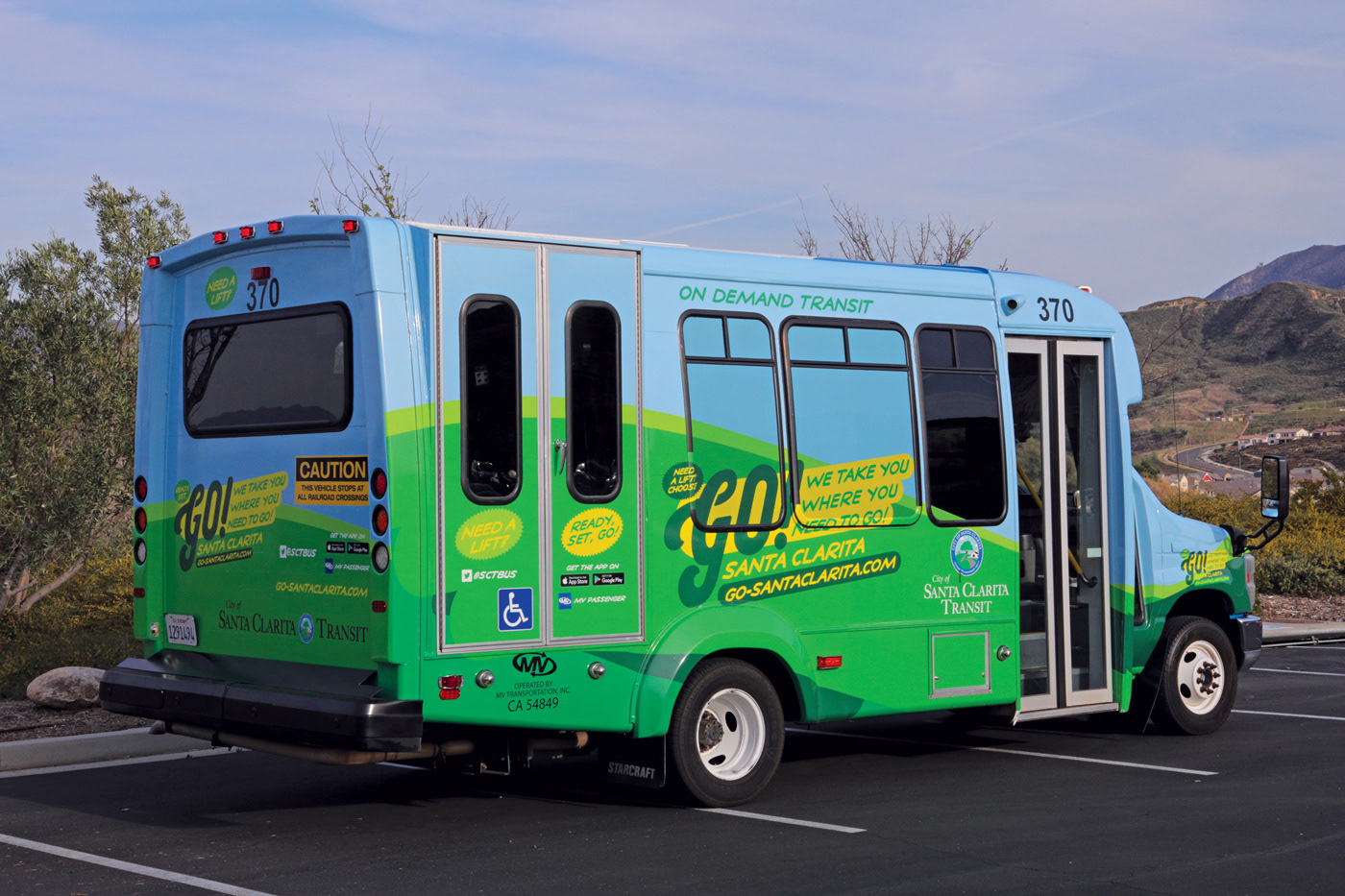
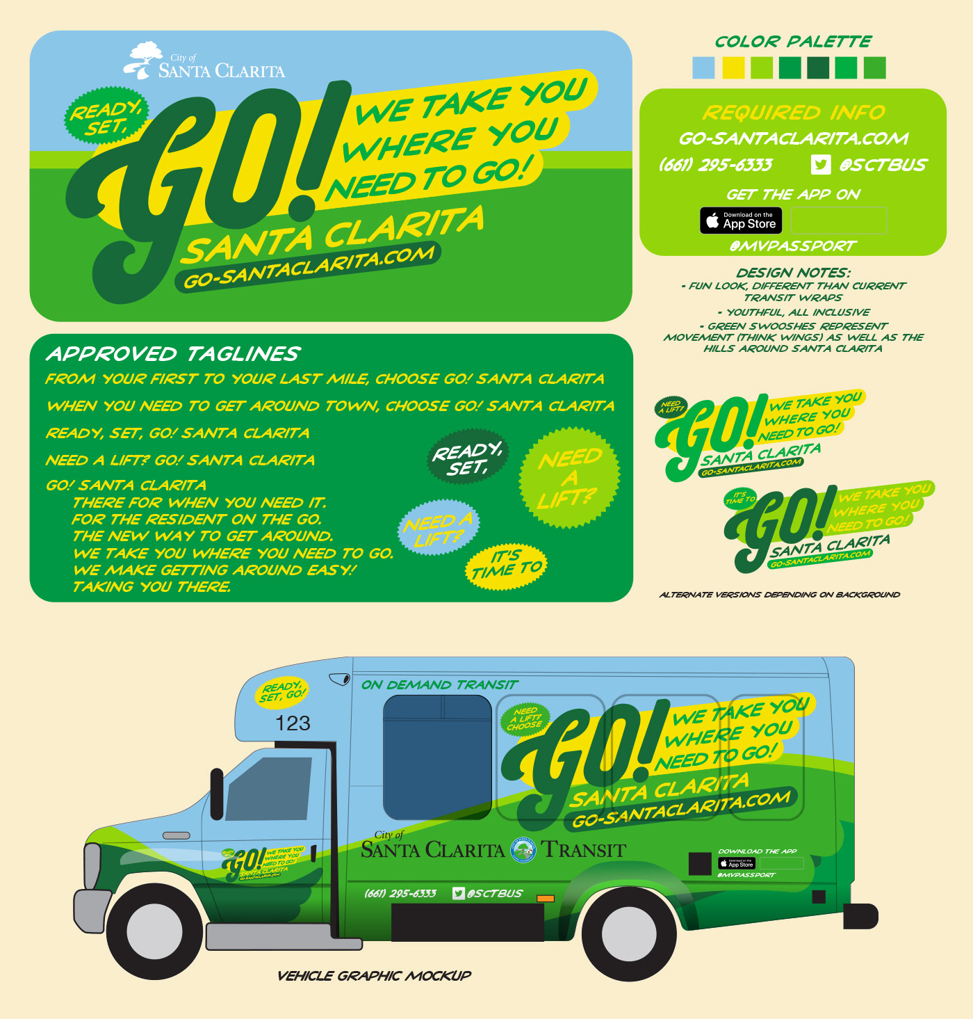
Go! Santa Clarita Vehicle Wraps and Identity
I designed this look for Go! Santa Clarita, which is a service of the Transit division. Similar to an Uber or Lyft, the rider can schedule a pickup in areas that are limited by normal transit options. Wanted to make this a bright, fun and cheery design that was clearly "Santa Clarita" but also have it stand out as something different from the usual services the City has to offer. I used rolling shapes and different shades of green to symbolize the vast green open space that surrounds the City, while the blue obviously is a stand in for the clear blue skies the City frequently enjoys.